.jpg)
The Sympathy Fund


Summary
• Delivered end-to-end product experience at all levels of fidelity in under three months as a solo UX resource on the project
• Hosted empathy workshops with key stakeholders
• Created a customer journey map to connect The Sympathy Fund experience to Legacy's broader product ecosystem
• Crafted user flow variants and wireframes in Whimsical based on product requirements
• Successfully presented design proposal in a storytelling session to Legacy's CEO, Stopher Bartol, and the CEO of OrgHunter, Chris Annase
• Designed full atomic design system and component library based on frontend framework, Material UI, to facilitate dev handoff
• Designed hi-fidelity prototypes in Sketch for mobile and desktop breakpoints

.jpg)
.jpg)
.jpg)
Solving for the financial burden of <end-of-life costs>
Families struggle to cover end-of-life costs
The end-of-life costs that come with the passing of a loved one are often sudden. From funeral expenses to medical bills, these financial hardships can exacerbate an already difficult situation, leaving families grappling with the added stress of financial strain.
Funeral organizers are reticent to ask for financial help
The Sympathy Fund eases the burden on funeral organizers by offering a discreet and compassionate platform to seek financial assistance, ensuring they don't have to bear the weight alone while sparing them the discomfort of directly asking for help.
Friends and loved ones need a medium to offer support
Supporting grieving friends and loved ones becomes effortless with The Sympathy Fund—a dedicated platform for contributions, condolences, and messages of support, fostering solidarity in times of loss.
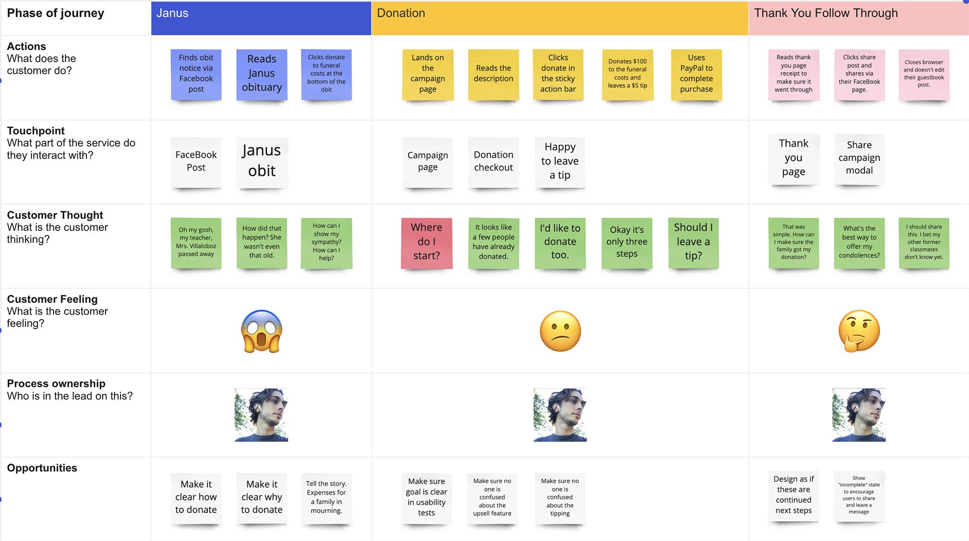
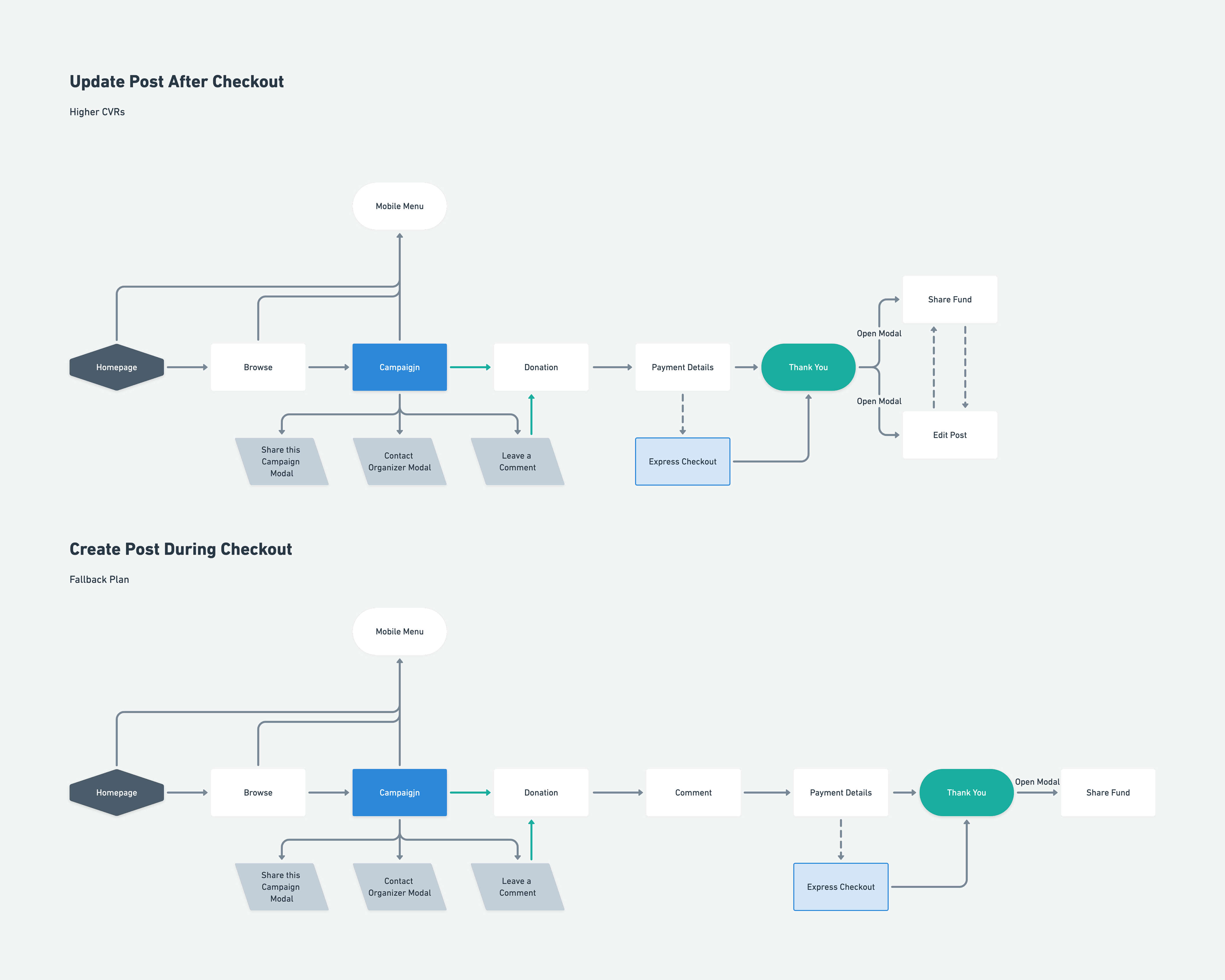
Research to wireframes in 30 days
Role-playing workshop: Following lean research methodologies, I hosted an empathy workshop with CX team members and key stakeholders as proxy users to map problems and opportunities that were derived from the role-playing activity.
User flows: Two user flows were created to determine whether commenting should come before or after the checkout experience. The team and I ultimately decided that social posts should come after checkout for a more streamlined conversion experience.
Wireframing: The proposed wireframes included a home page, a browse page for search and discovery of funds, a fund page that was linked to from the deceased's Legacy obituary, and a multi-step checkout experience that utilized CRO techniques.
Fund search & discovery
Created for non-direct Legacy.com traffic (inbound traffic from search engines or social media), the fund search and discovery section features the home page, and the browse page, with the combined goal of building brand awareness, and helping donors find funds to place donations.
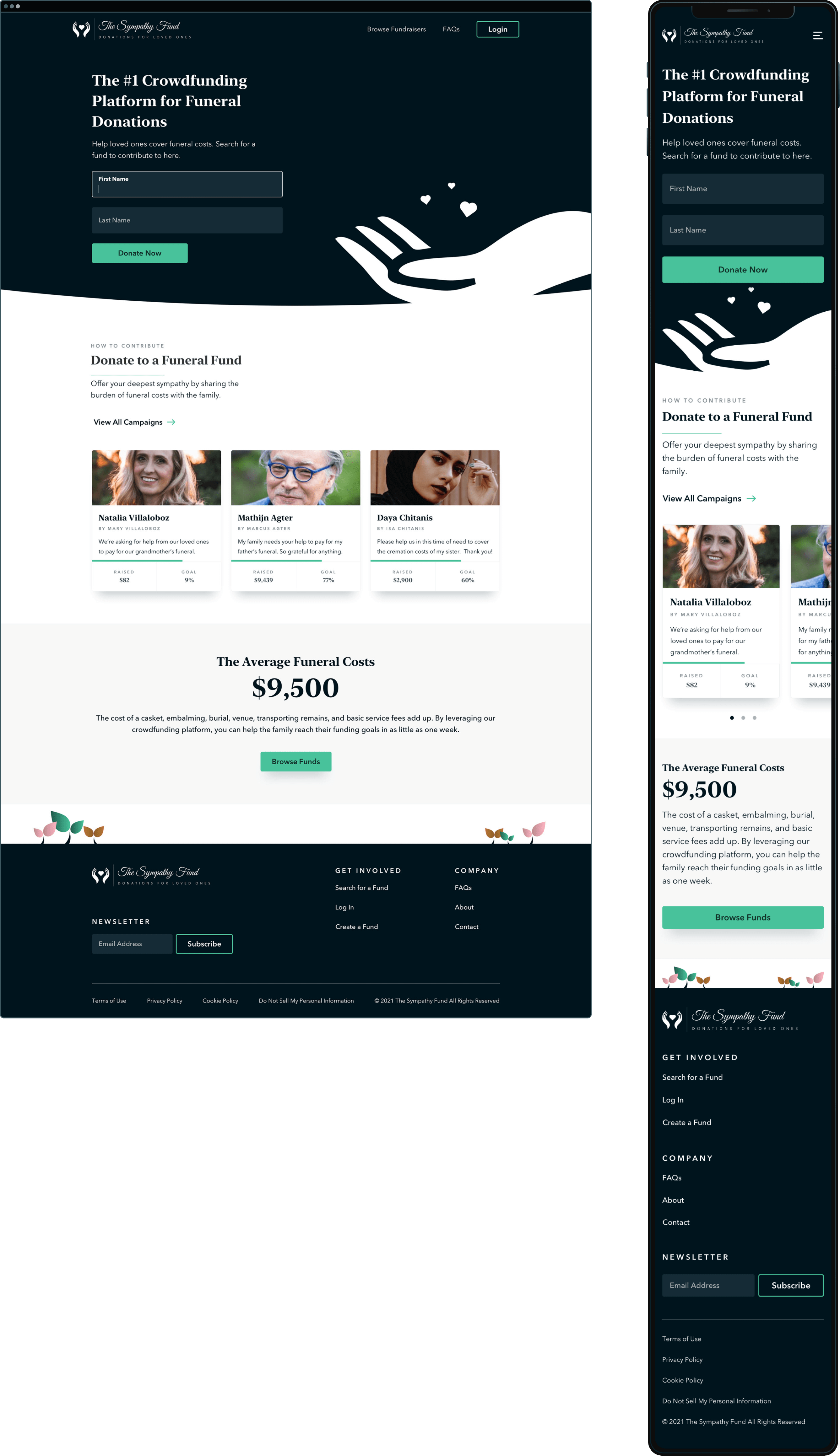
The home page
The home page establishes the brand identity and mission as a crowdfunding platform for funeral donations. The minimalist design with zero fluff allows users to focus on a few core elements. The last section showcases average funeral costs to tell the story of the financial hardship the family is facing, as a way to encourage more donations.
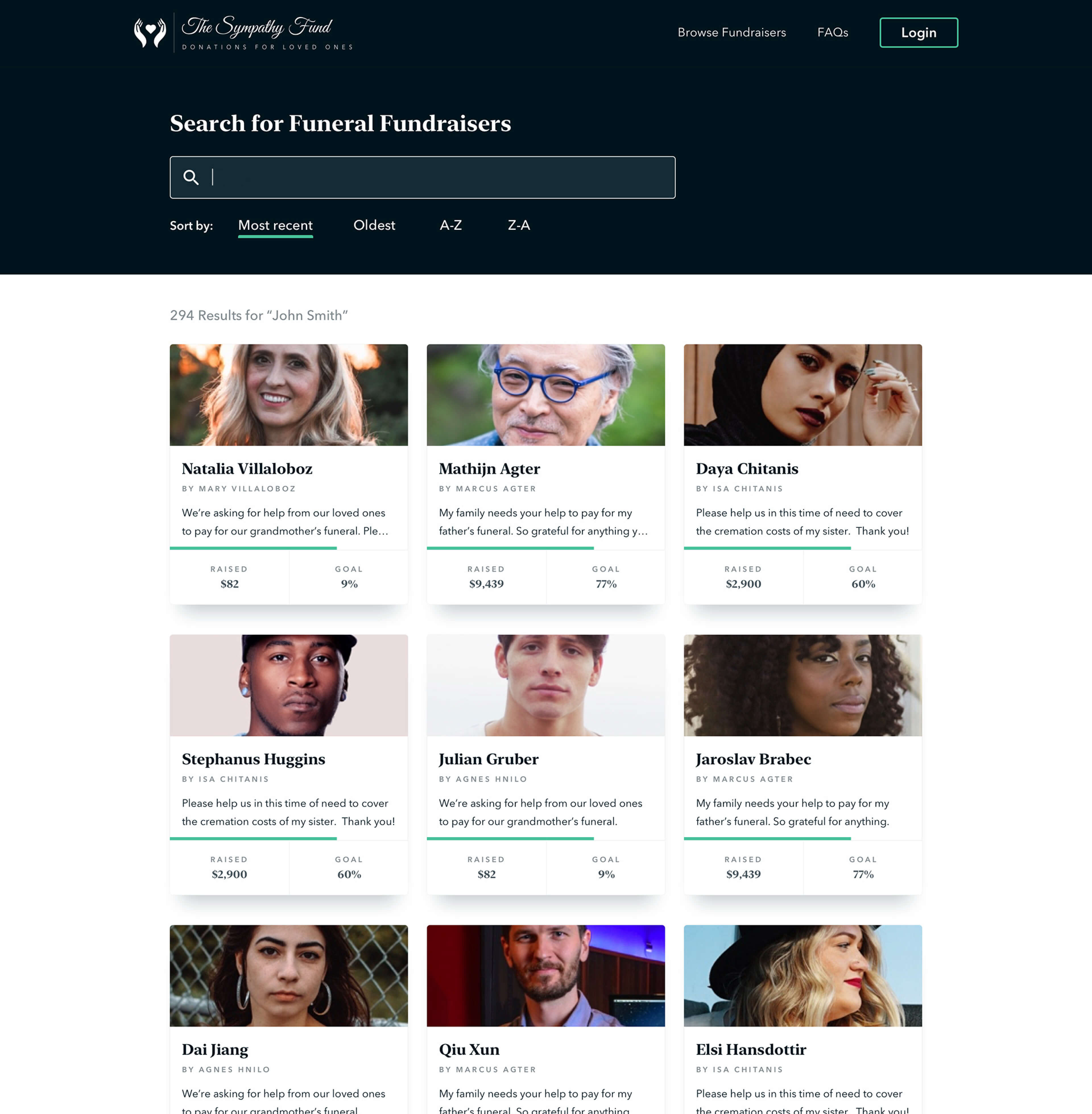
Browse funds
The browse page allowed users to browse active funds through paginated results or searching. Funds are represented as cards that showcase a fundraiser progress bar and statistics showing the amount raised, and percentage of goal reached.

Autocomplete search
The rich autocomplete divided funds by search matches, suggested funds, and recent searches.
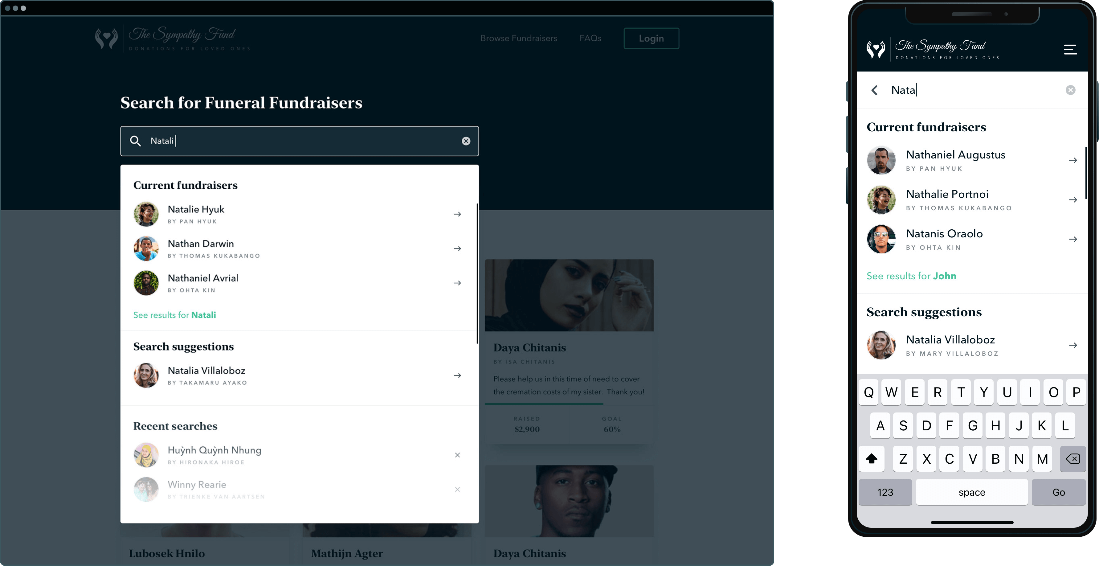
No results
The No Results page offered a course correction in case of a misspelling of the name, in "Did you mean X?" with a link to that individual's campaign.
1.1 Persuasive microcopy
A banner at the bottom of each page encourages donations by bringing attention to how quickly fund goals can be reached. Another banner the stark reality of costs faced by the family.
1.2 Fund cards
Fund cards are designed to give a quick overview of the most important details of the fund, including the deceased's name and photo, fund organizer name, and a brief description of the fund.
.jpg)
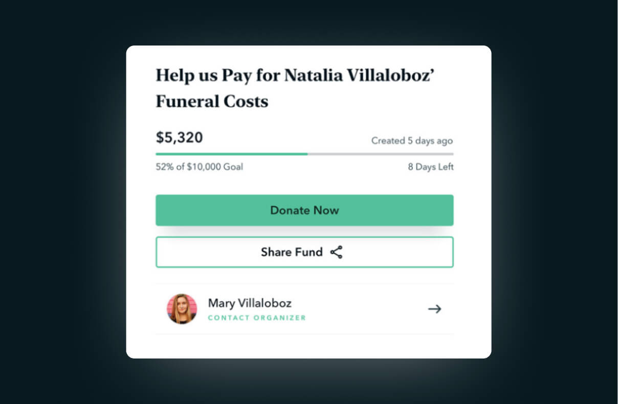
The fund page
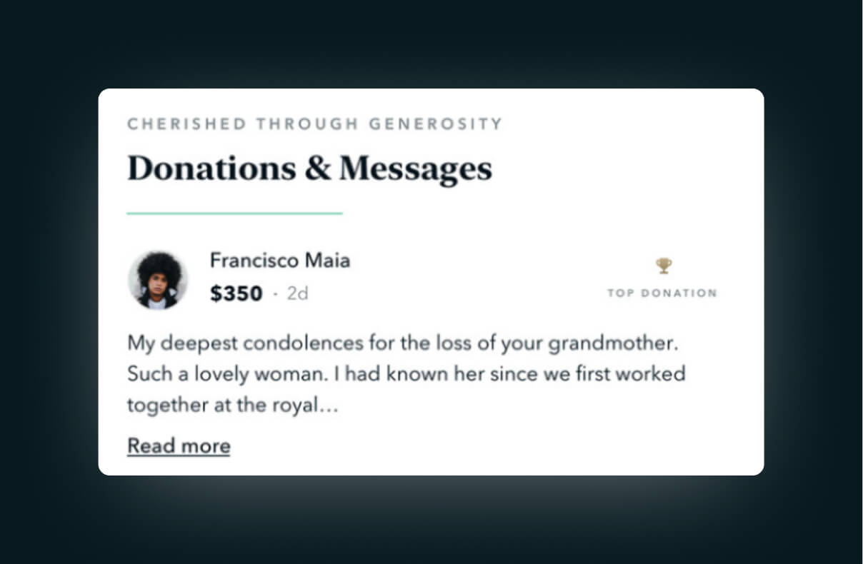
The fund page is where the magic happens. The fund card from the browse page blooms into greater detail, showing the number of days left, fund description, a built-in chat experience with the fund organizer, fund stats, and a social section that showcases donors, donation amounts, and optional messages that doubled as social media posts to improve results from organic sharing.
Share fund
I designed a custom sharesheet for desktop, whereas the mobile version leverage native OS share sheet functionality.
Contact organizer
Users were able to contact fund organizers with any questions they might have. The concept proposed placing FAQs beneath the form elements to help answer common questions.
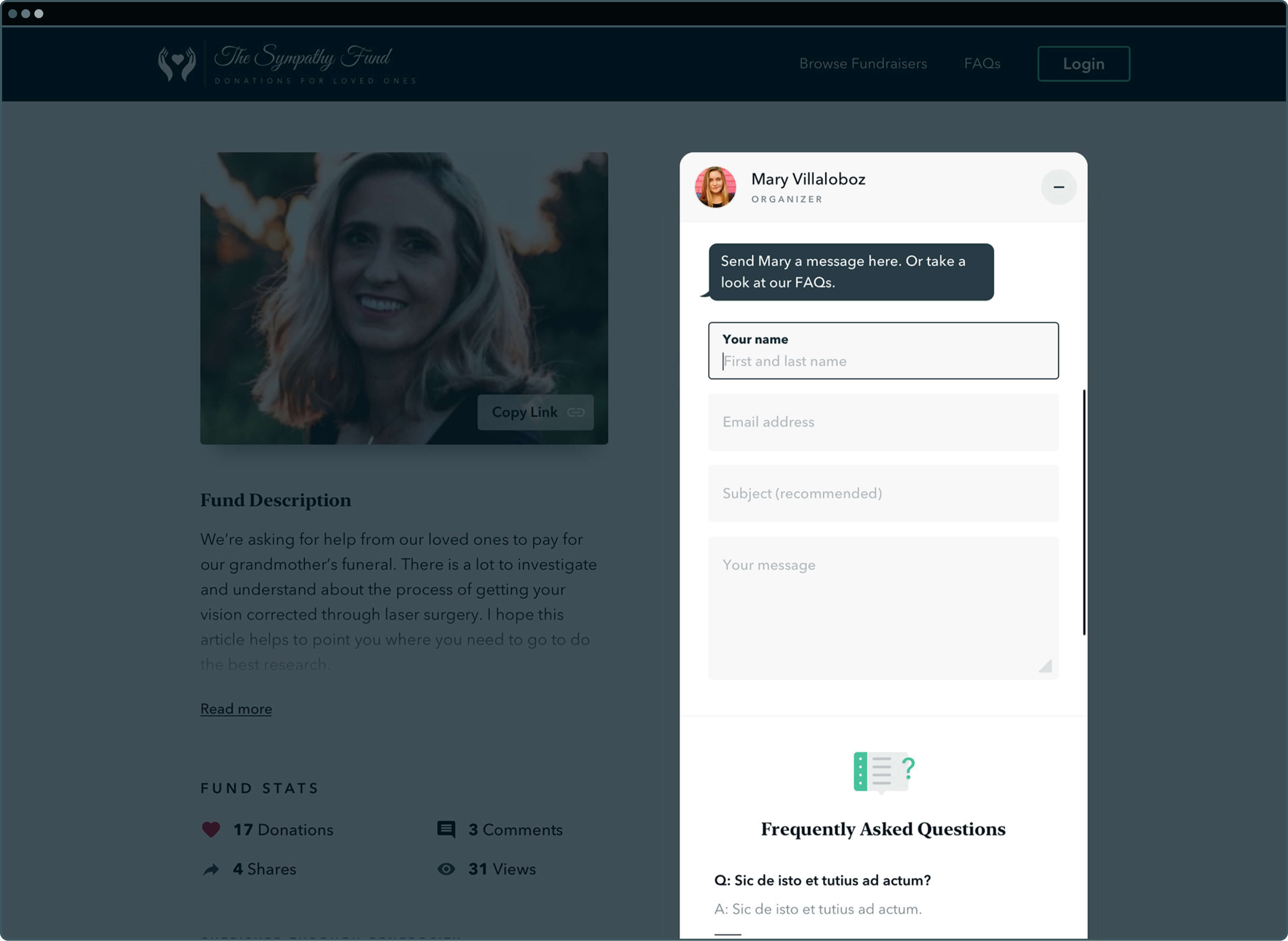
2.1 Floating CTA section
The floating CTA section on the right follows the user as they scroll through the page to maintain a sense of orientation around those desired actions (donate, share fund, contact organizer).
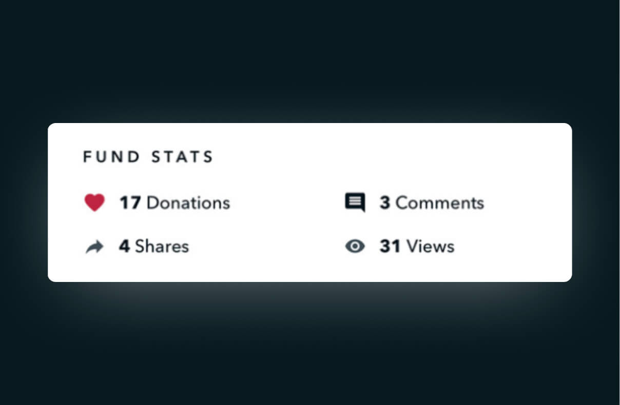
2.2 Fund stats
To promote more engagement and a sense of community, a fund stats section was created, showcasing the number of donations, shares, comments, and views.
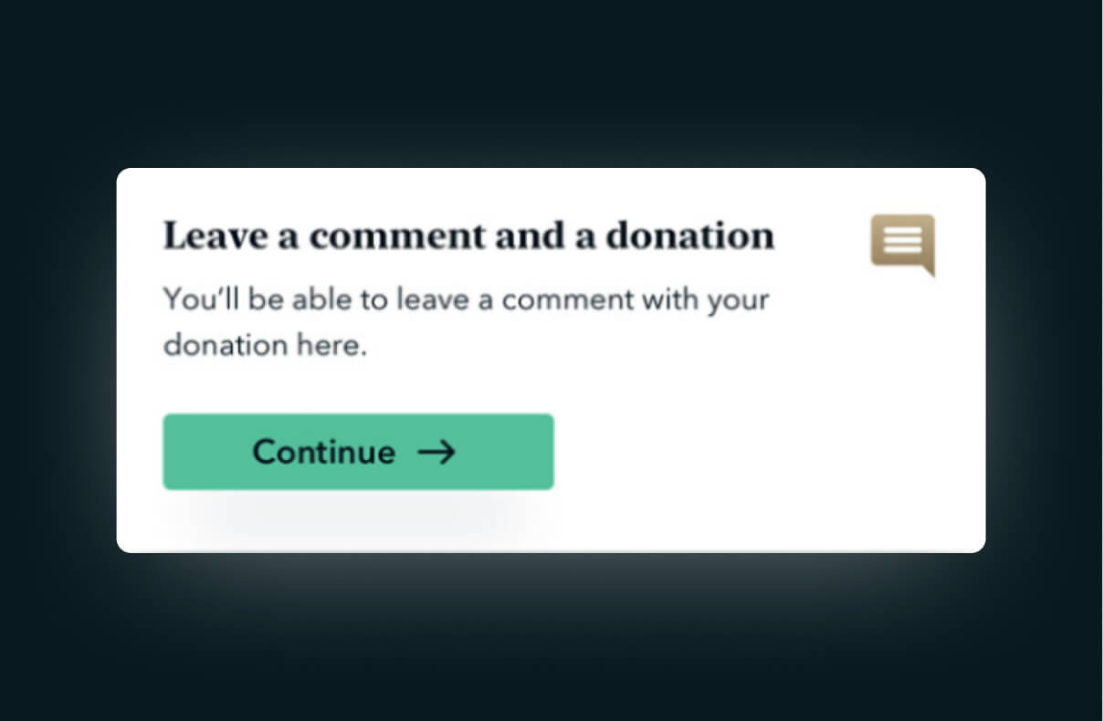
2.3 Personalized messaging
The ability to comment was strictly limited to donors to prevent comments from bad actors, which was not an uncommon occurrence on Legacy.com.
2.4 Social posts
Akin to a memory wall, social posting encouraged sharing your donation and post with your social networks to increase fund awareness.
Checkout
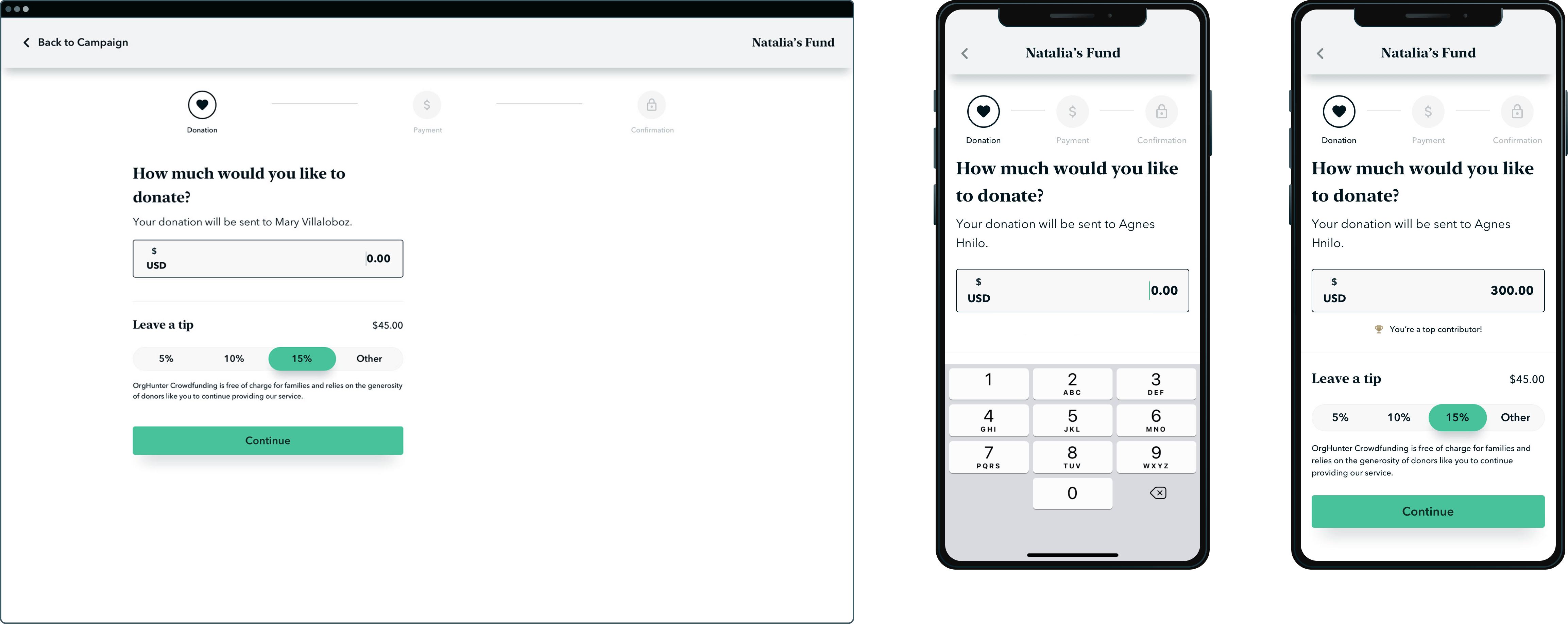
Clicking "Donate" on the campaign page would take users to the checkout flow, where they were guided to make their donation and leave a tip via a short multi-step funnel.
Set donation and tip amount
The first step was simply to set the donation and tip amount. A few dynamic elements existed on the page to reassure the user that their donation was going to the correct fund. Looking back, I would have done this a little differently and might have included a photo of the deceased as a visual anchor.
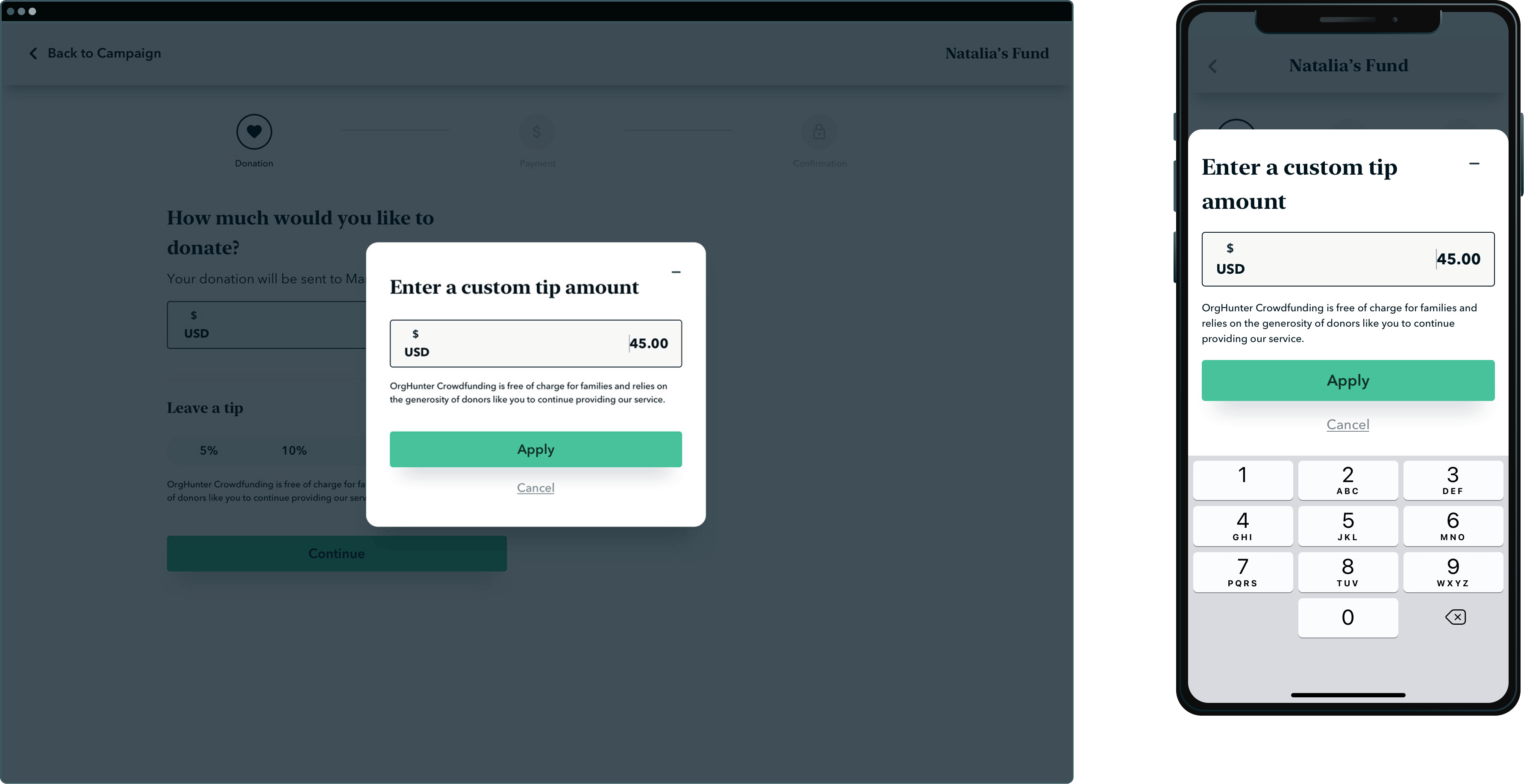
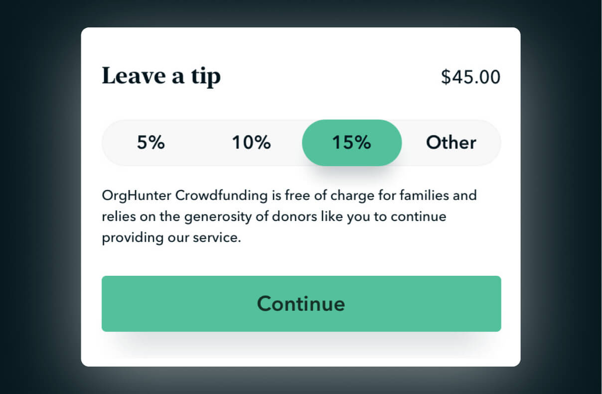
Enter custom tip
Because tips were the only revenue stream outlined by the business model, I created a barrier to entering $0, by including default contribution chips, and by forcing users to click "other" to type in $0 manually.
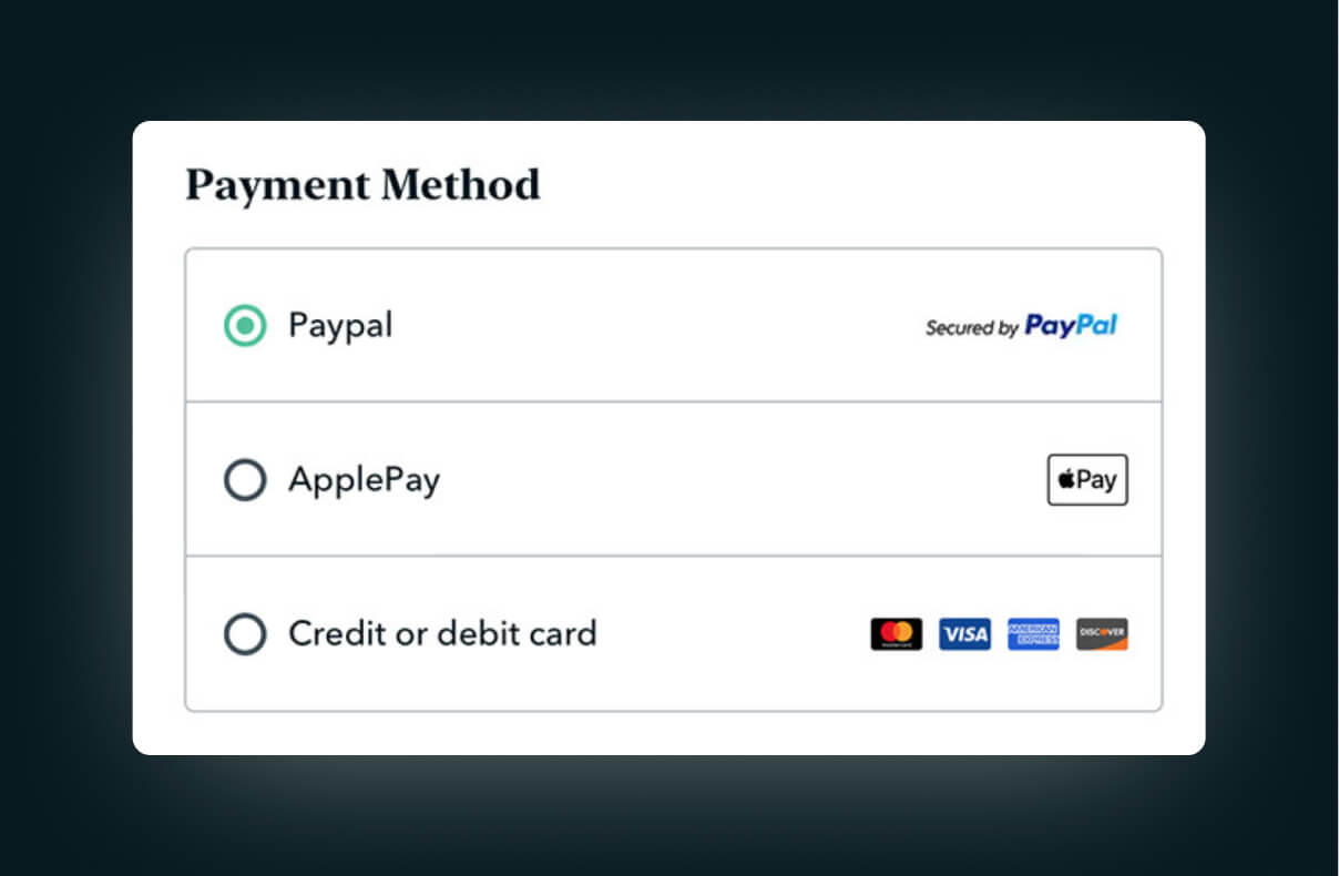
Express payment
Payment featured express checkout options including PayPal and ApplePay. The total was itemized on the right, and again dynamic text was added to reassure the user that their payment was going to the correct fund.
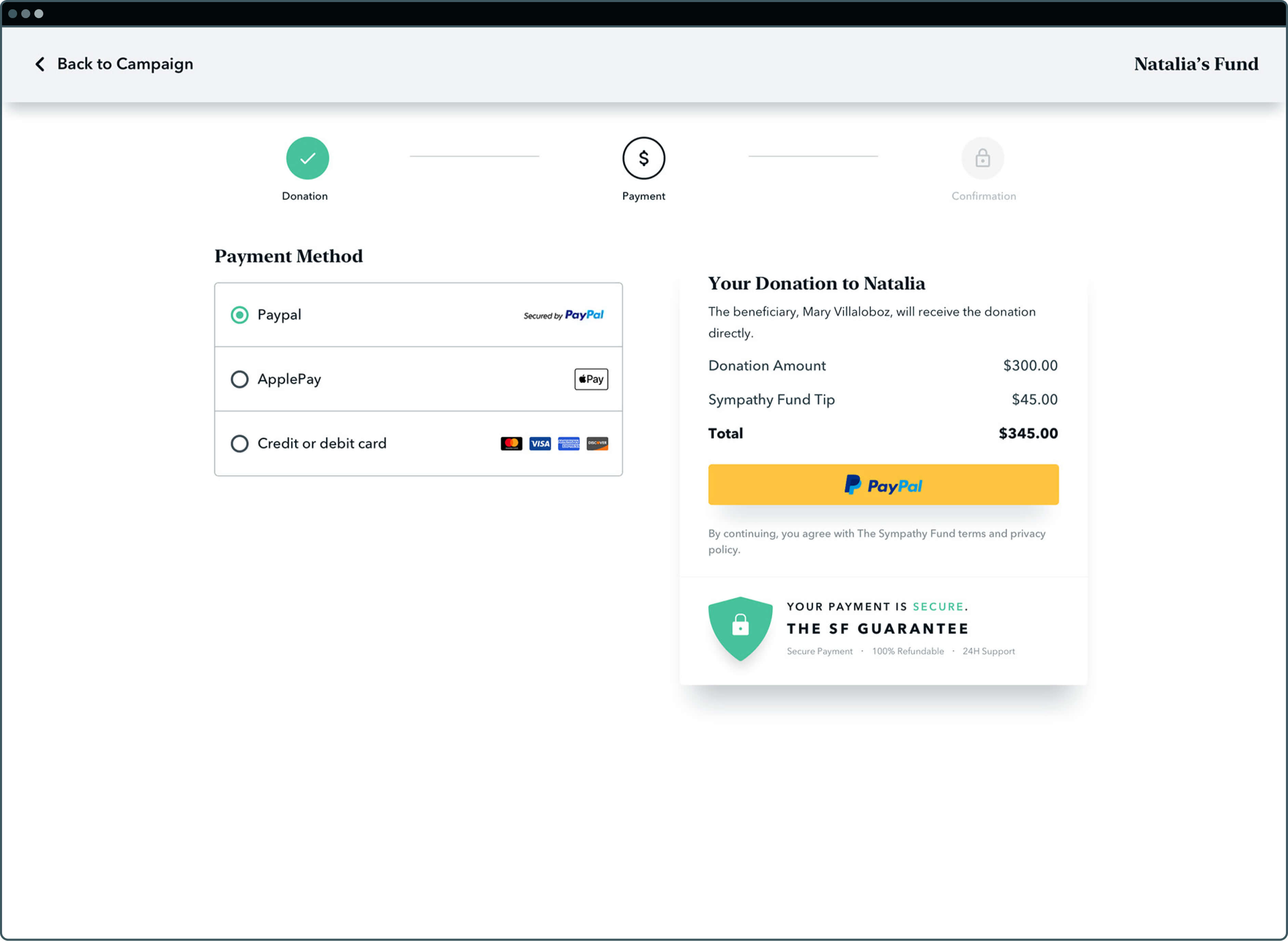
3.1 Default tip contributions
This design pattern was a means to ensuring profitability, and was an opportunity to explain our 0% fee policy while asking for a small tip to support our service.
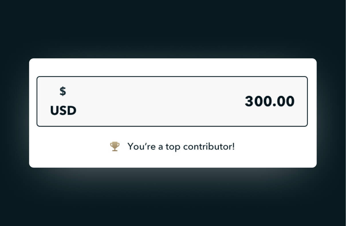
3.2 Gamification
The UI gamified the donation amount by encouraging them to give more based on how close they were to being a top contributor. I argued against this feature, given the sensitive subject matter.
3.3 Express checkout methods
Giving options to checkout with expression methods like PayPal and Apple pay is a standard eCommerce practice that reduces friction and facilitates conversions.
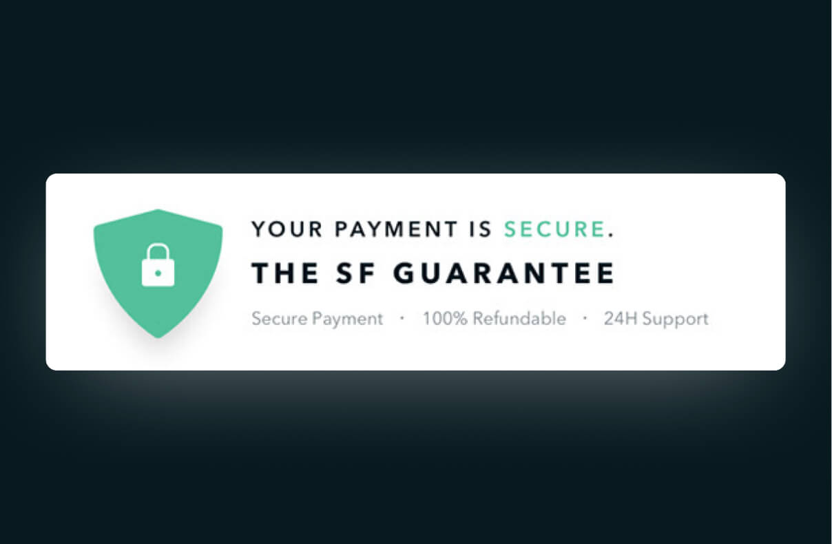
3.4 Trust icons
Our policy guaranteed 100% secure transfer of funds or your money back. To build trust and increase conversion rates, this policy was represented as a trust icon beneath the final payment CTA.
Thank you page
The Thank You page was by far the greatest UX challenge on this project. While our primary goal of receiving the donation had already been met, secondary business goals sought to capitalize on the momentum of users to increase fund awareness leveraging social networks of donors.
Secondary business objectives
I placed the secondary factors on the right side and changed the horizontal steps in the checkout process to a vertical format with two steps. The steps were labeled as "Incomplete," similar to how an unfinished profile prompts users to take action. The initial step involved inviting others to donate and included persuasive wording such as "Fundraisers that are shared on social media achieve their goal 5 times faster on average."

Posts
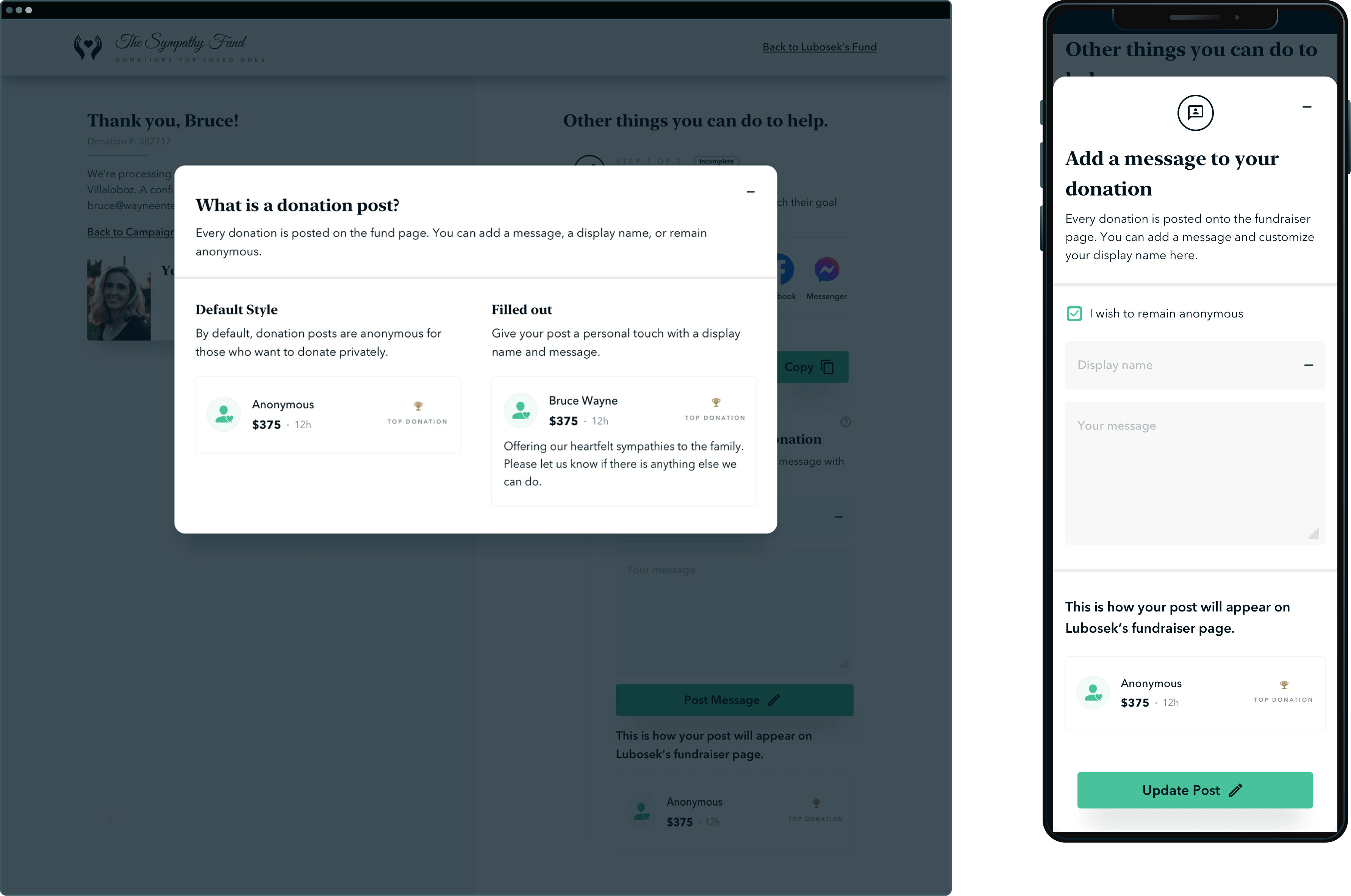
The second step was a bit more complicated because it lacked context for what a "donation post" was. An information icon for those who were curious would pull up a modal showing a sample donation post, which defaulted to anonymity, but looked more robust once filled out. Looking back, I would have considered combining these two steps, where a user could opt to create a social media post out of their fund post.
Outcome & results
Legacy pursued the funeral donations space as a new branch in an incubator setting that I piloted. The project resulted in an exciting proof-of-concept, but the business was unable to allocate development resources during its completion at the height of Covid and has since put development on hold.

Chris Annase
CEO, OrgHunter, The Sympathy Fund
Up next
Continue exploring my work below.
.jpg)
.jpg)